6 ways to make engaging screenshots in product updates
Tips and examples for improving product screenshots for feature announcements

/
0 min read

These tips work well for social posts, slides, or anywhere you need a visual for product updates. You can also translate them to video when ready.
Tips
Mock up user interaction
Focus attention with skeleton UI
Exaggerate key UI
Wrap screenshots in 3D device frames
Add Annotations
Stack multi-step workflows like comic book panels
#1 Mock up user interaction
Show user interaction. You can add mock up mouse cursors via Figma to illustrate a key interaction, or a cursor mid-input. It's better to handle this in post production via tools like Figma or Canva, so you can adjust or resize the cursor easily if things change.
Example: Liveblocks cursors resizing designs in Figma
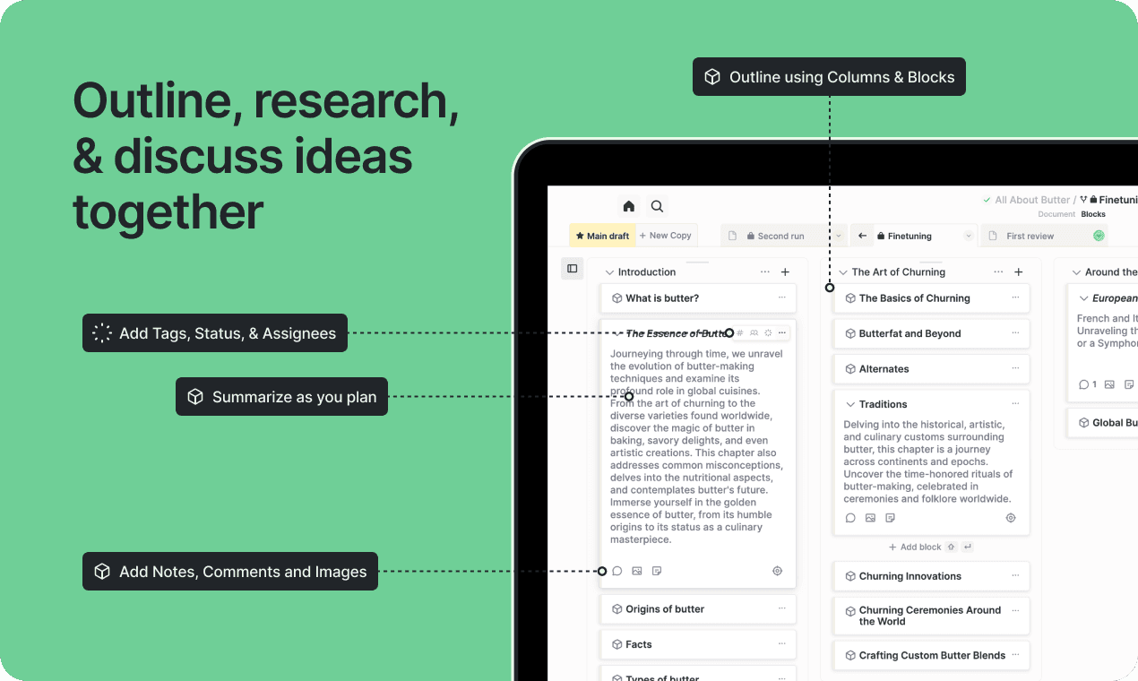
Introducing the Liveblocks Collaboration Kit for Figma shows cursors for dragging and dropping, resizing windows.
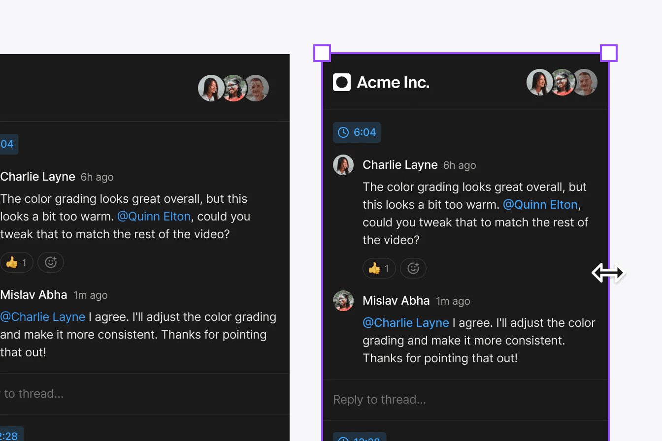
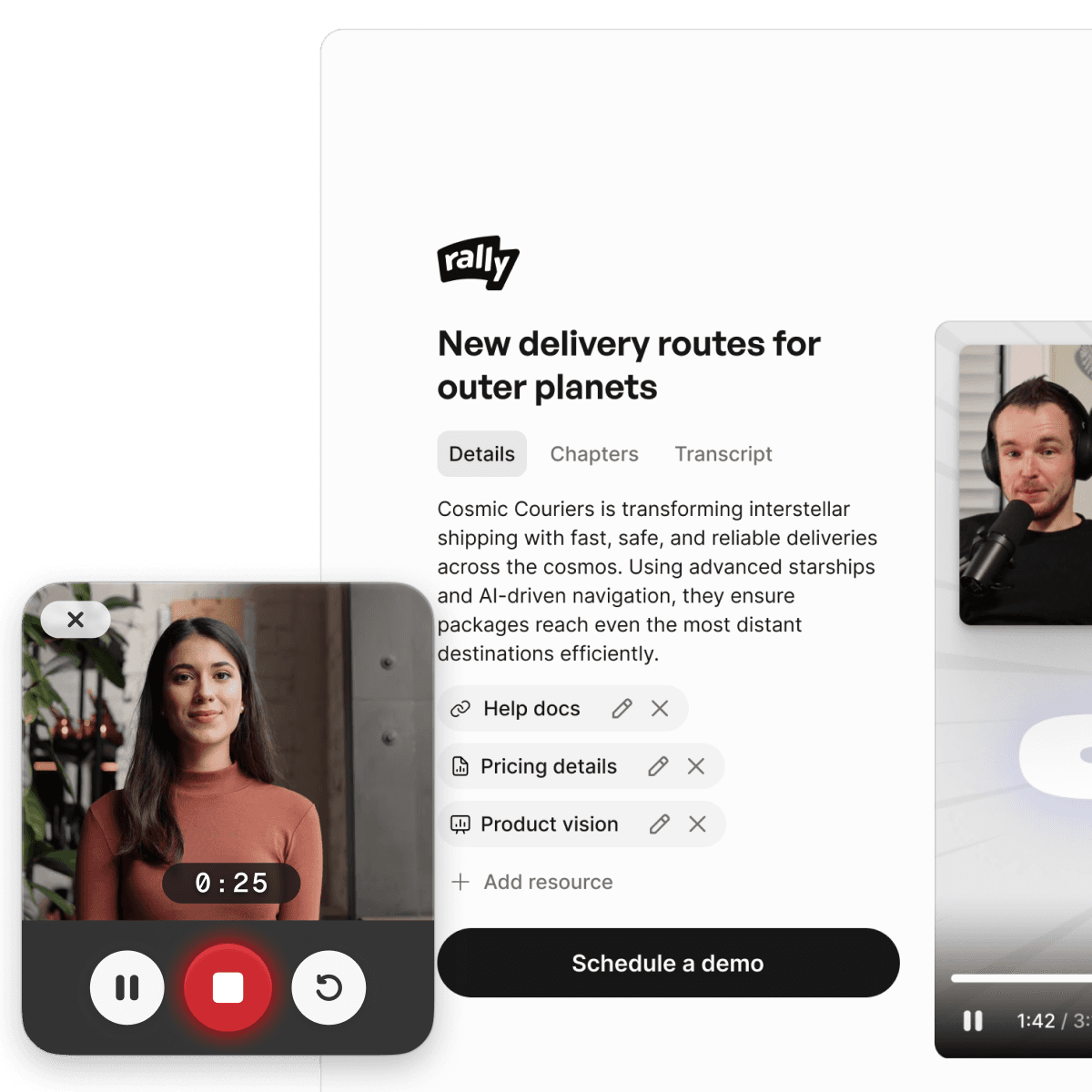
Example: Fynk showing multiple people involved
Fynk uses multiple cursors to show different people working in their app.
#2 Focus attention with skeleton UI
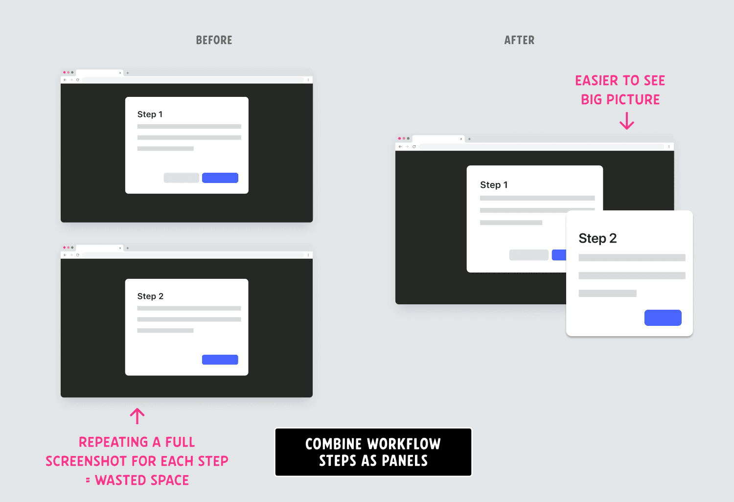
How much detail should screenshots include? As little as possible to get your point across.
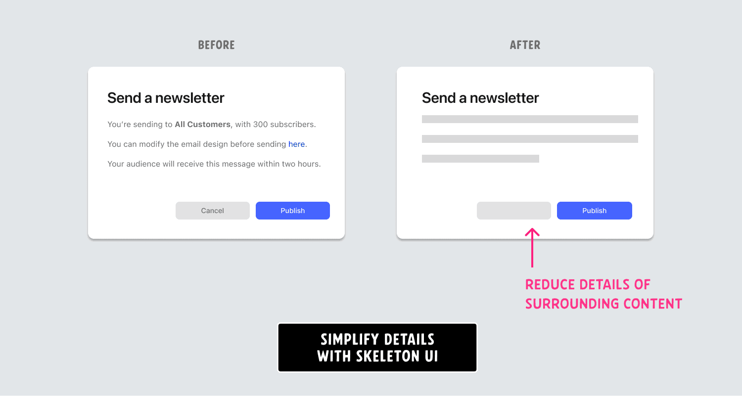
Before you take a screenshot of your entire screen for the next blog post, here’s a better way to present complex features without overcomplicating your message. You can use these images for video later, but this approach makes it easier to present multiple steps in a compact space.
Reduce your screenshots to the minimum UI required. You do not need to show the entire page to introduce a new element on the page. Zoom into the element you have to show, and frame around it. Once the audience is oriented, pull out the components and preview them one at a time. Use progressive UI to reduce noise and focus attention towards the relevant content.
Reducing the details in a screenshot will also increase the lifespan. Details add more ways for product content to fall behind.
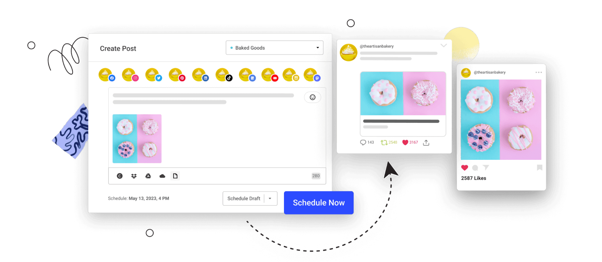
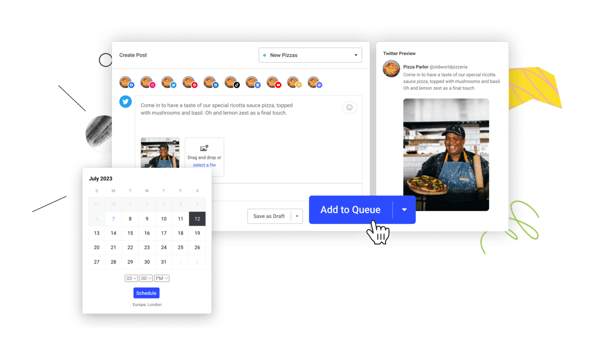
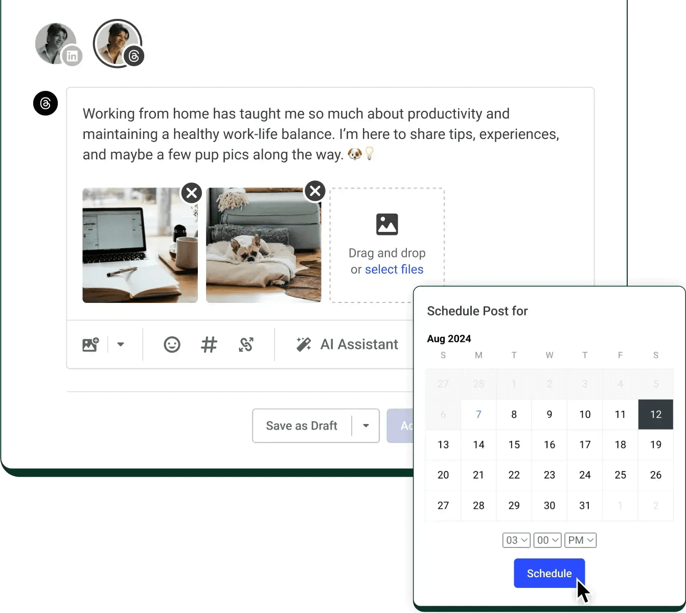
Example: Publishing to social via Buffer
Buffer uses floating components, and progressive UI on their site to demonstrate how their publishing process works in-app. In this example, the specific text of the social media post doesn’t matter, so it becomes a reduced text shape:
Avoid complicated backgrounds
Keep the background simple, almost forgettable. A solid background color within your brand palette is straightforward and frames most content well. If you're feeling fancy, go for something like the default wallpaper on a new laptop. Treat your screenshot content like exhibits in an art museum – the content should do most of the work, but you can provide context with a few words.
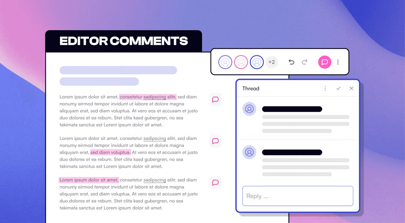
Beehiiv does a subdued background and annotation with their product release for Editor Comments.
#3 Exaggerate key UI
Altering the size of the important UI within the screenshot is a good way to call attention to key actions. For example, making a button larger than normal and breaking out of the frame (see Buffer example above). The goal of these screenshots is to communicate what the feature does, and outside of documentation you can take some artistic liberties to get the point across.
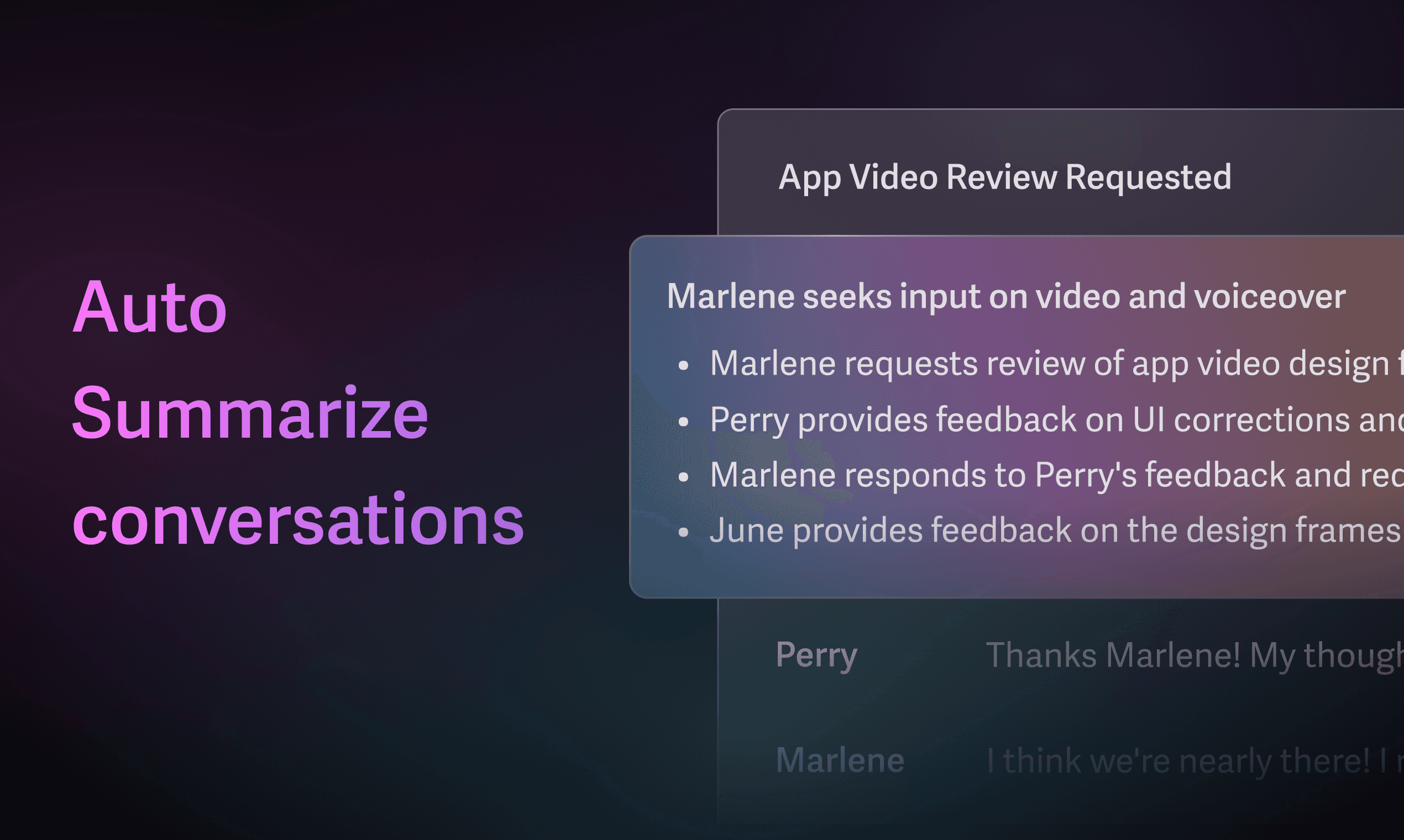
Example: Superhuman AI summaries
When highlighting the new release, Superhuman expands the AI summary block for email.
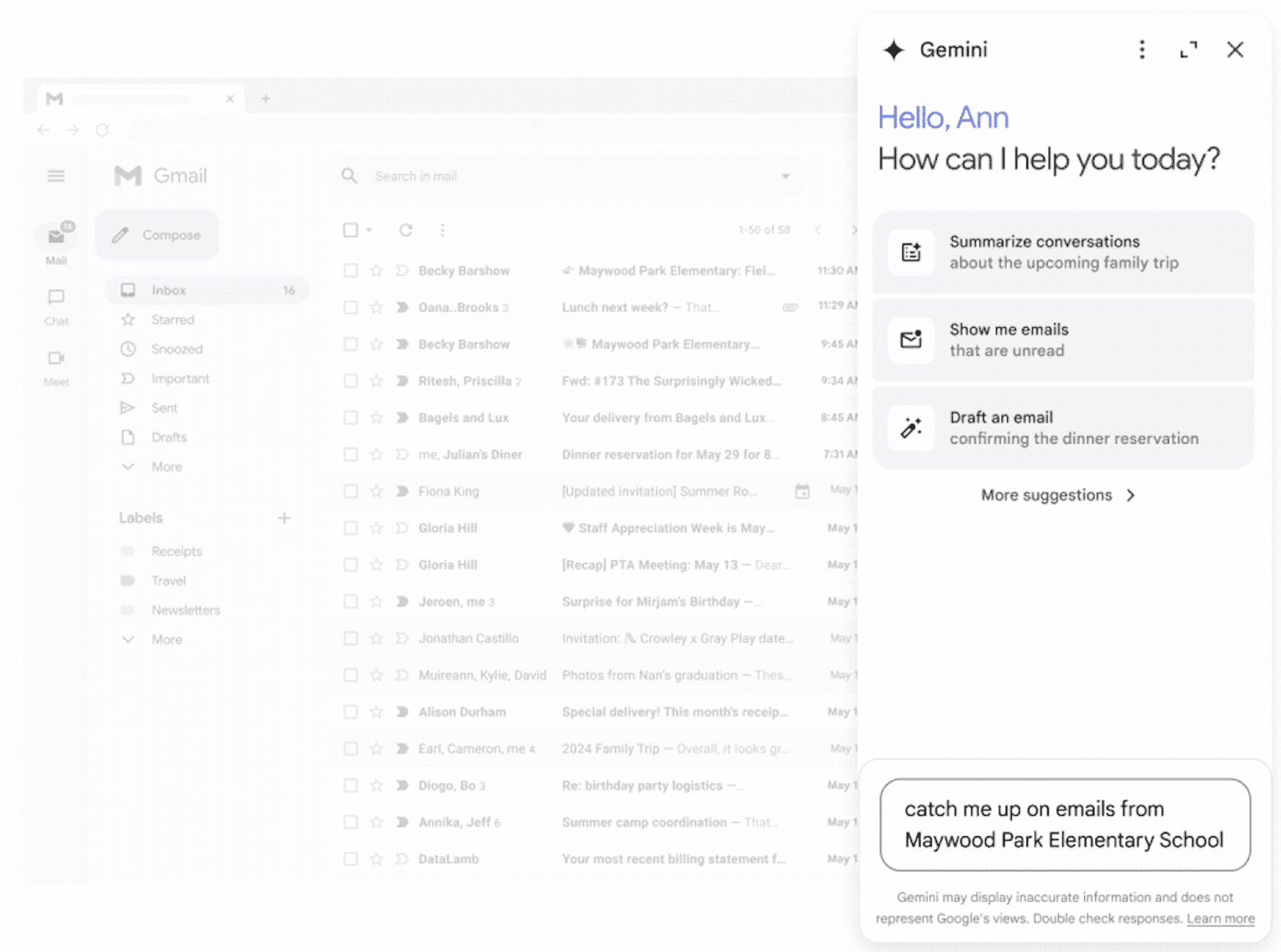
Example: Google Gemini panel in Gmail
The Gemini side panel is oversized, and the background is a faded version of the Gmail inbox for context.
#4 Wrap screenshots in 3D device frames
Device frames add context to a screenshot and 3D perspective makes them more interesting than straight on viewpoints. If you have multiple form factors to support, use device frames to show “family” shots of mobile/web/tablet quickly.
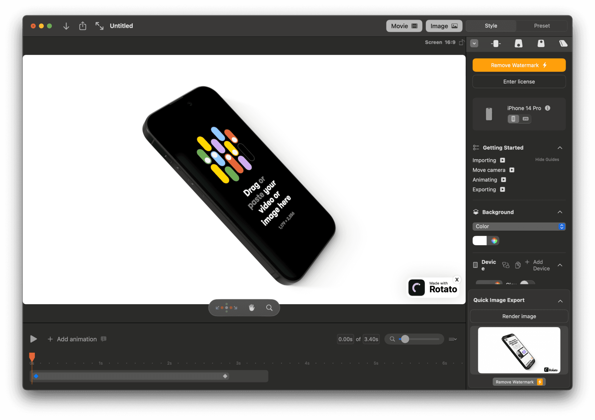
Rotato is one paid app for generating screens on device renders in 3D. If you want 2D, Figma has multiple ways of doing this for free. Figma Slides has templates which include device frames and can automatically pull in live designs. You can also use community plugins inside the design editor.
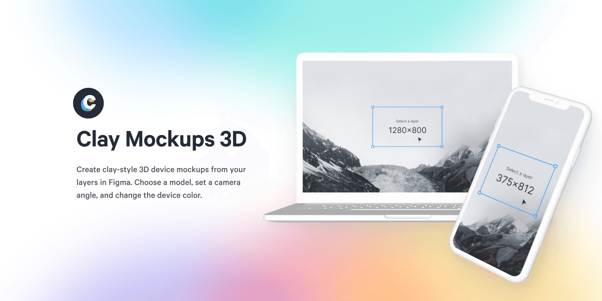
You can find more device frames in community files and plugins from Figma:
Clay Mockups 3D (Flat monochromatic effect)
Does your design team use Figma? You can export the individual UI components as images via the Export panel or by right clicking the component Copy/Paste As > Copy as PNG, then pasting the image from your clipboard into a document.
Not every screenshot needs a device frame
As seen in the previous example from Buffer, you can also go in the opposite direction and go frameless. This gives your UI a floating effect, which is less rigid and lends itself well to multiple steps or annotations.
#5 Add Annotations
Draw directly on the important parts of the screenshot, or take a more refined approach with floating labels. This is also a way to nudge folks in the right direction with your brand voice. Annotations are a common pattern for screenshots in mobile app listings due to limited space. Check out iOS or Android App Stores for more inspiration.
Example: ButterDocs outlines
ButterDocs uses annotations to highlight features in context of the entire app. The amount of UI might be overwhelming for folks to navigate otherwise – the notes help you reach a “so what?” moment faster.
#6 Stack multi-step workflows like comic book panels
Breaking the components out also allows you to show multiple steps of the same workflow in limited space.
This approach helps in cases where you need to show workflows in a browse-able format, outside of a video walkthrough.
Example: Scheduling posts in Buffer
In the example below from Buffer, you can see the draft and publishing steps together. The positioning of the scheduling step is near the publishing button, making it easier to understand the relationship between both steps. It’s like reading panels in a comic book, where each panel progresses the story.
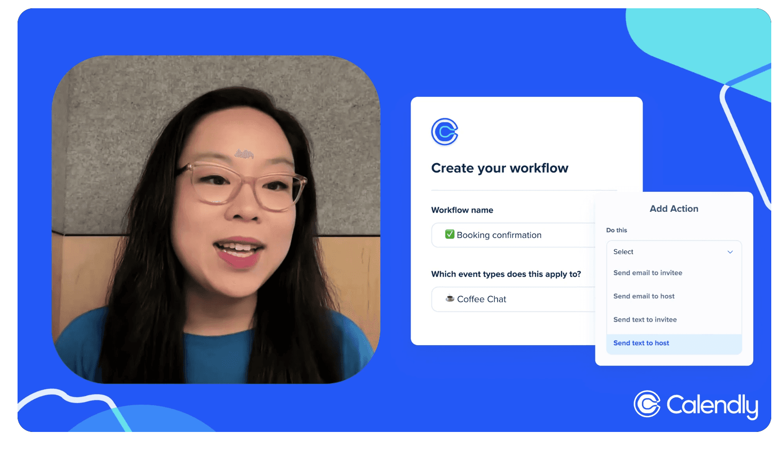
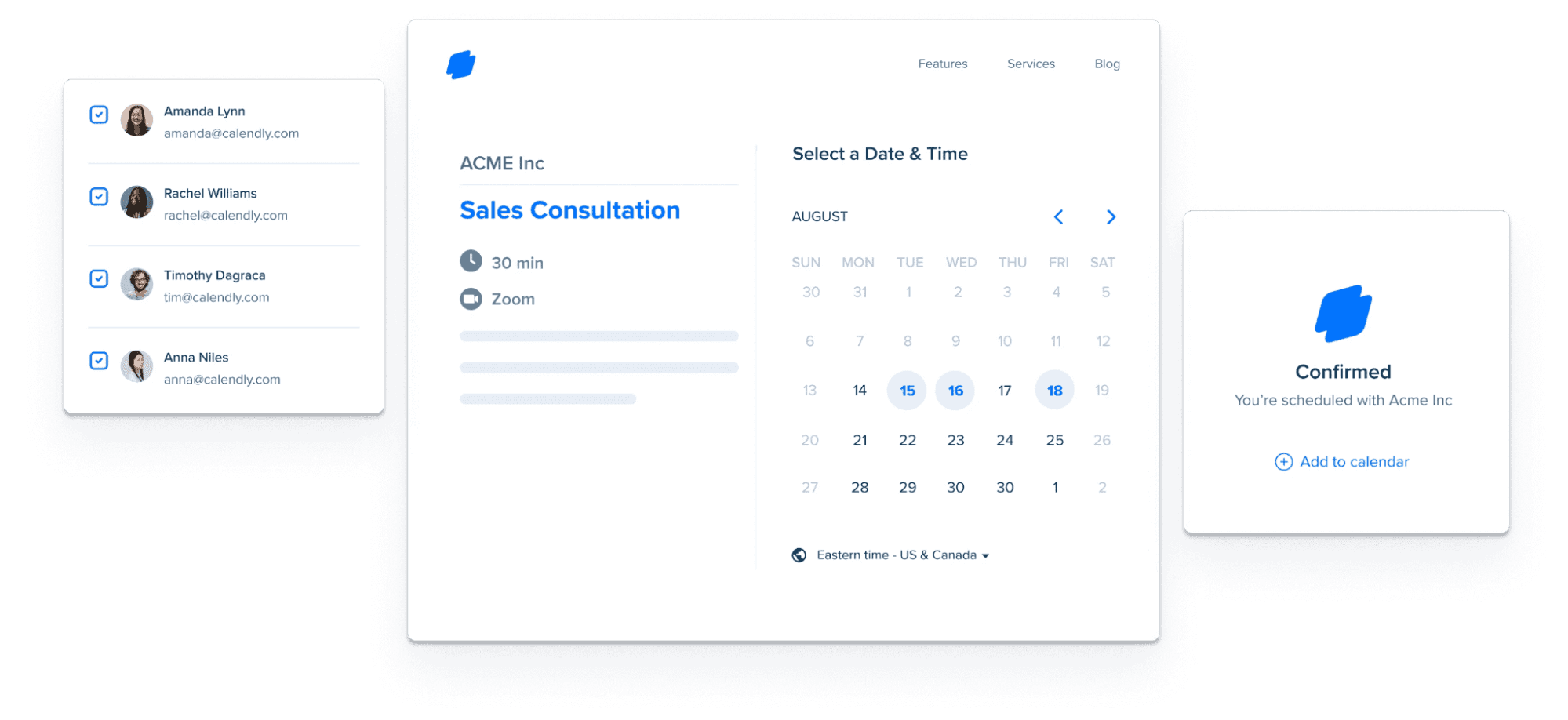
Example: Calendly booking workflows
Calendly does a similar approach for their feature pages, with key UI elements to show invitees → time selection → confirmation steps. They reduce extra details in the UI, which allows them to show more of the workflow without getting too noisy.
Wrap Up
You can use any combination of these six tips to make your next feature's screenshots more engaging. In the meantime, give them a try in an upcoming presentation that still feels a little bland. It's low effort, high reward — promise.